No Products in the Cart
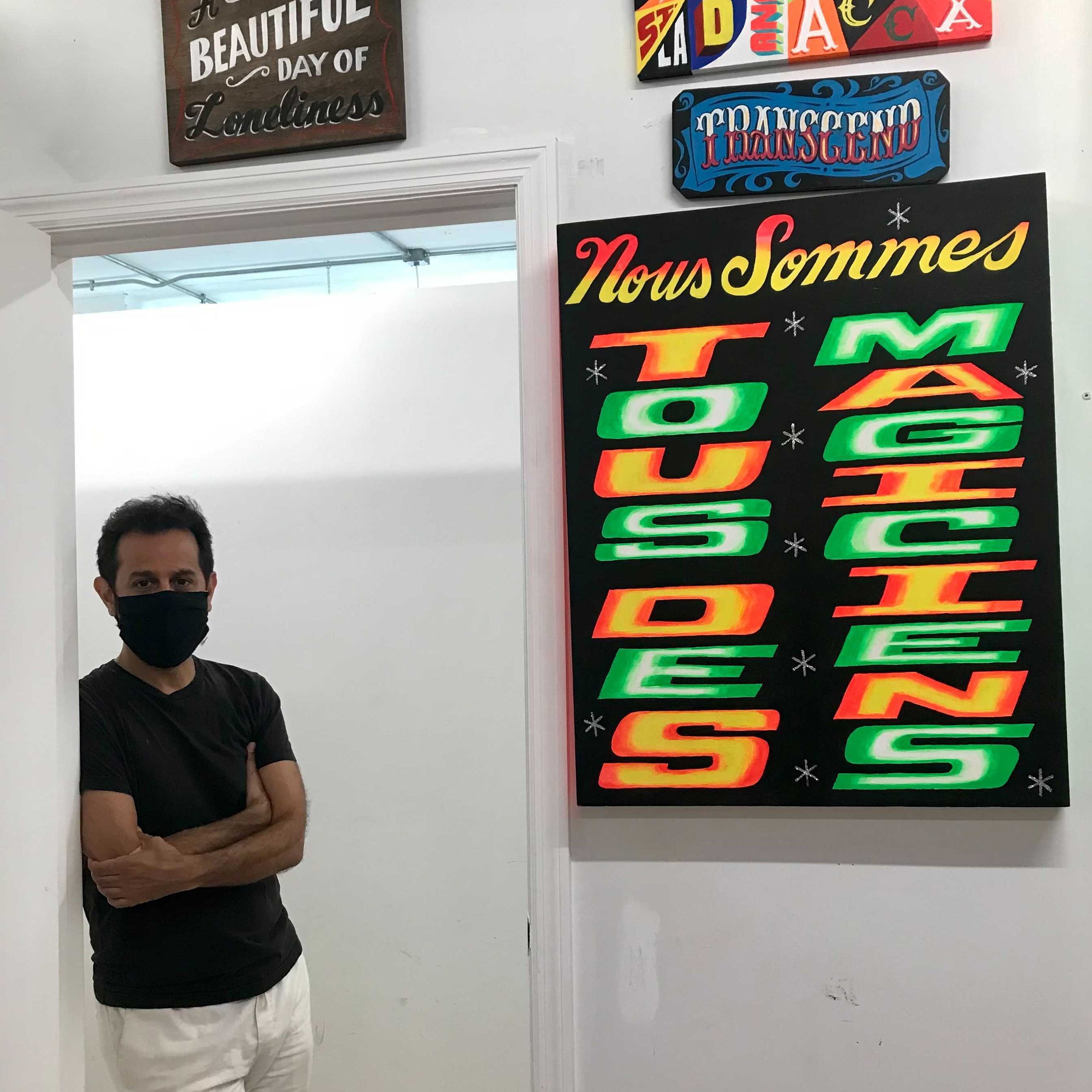

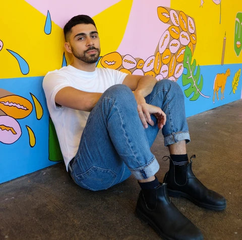
Pablo A. Medina is a Cuban-Colombian artist living and working in Brooklyn, NY. In 1999, He was the youngest exhibitor in the Design Triennial exhibition at the Smithsonian’s Cooper Hewitt Museum. He has been a contributing artist for a series of fundraising exhibitions that have collectively raised over $13,000 for non-profit organizations including ACLU, The Standing Rock Council, Make the Road NY and City Harvest.
So, tell me how you came into the world of painting!
I went to Pratt where I was and a drawing major and a printmaking minor.
I grew up coming out of the punk scene in the late 80s. So combining a punk rock sensibility with art school led to a very independent-minded, DIY ethos for me. In college, we had this band that we were taking pretty seriously. We toured the country and put out records and that was my focus for a couple of years around 1991-1992.
When we graduated college, we went on tour, and kept playing for a while but the band broke up, and so did the relationship that I was in at the time. I was completely lost and unsure what direction to go in and, although I had a fine art degree, I hadn't really stepped foot into the “fine art world” to be able to actually consider that I could make a living in that world. So I went back to school for graphic design.
And what was your most important takeaway from studying graphic design?
I was visiting a particular neighborhood, across the river in New Jersey in a town called Union City, which is a predominantly Latin American neighborhood. At that time, it was reminiscent of Latin America in the sense that there was a lot of hand-painted signage and hand-painted letterforms so for my thesis project in grad school, I designed a series of typefaces that were inspired by this neighborhood. Focusing my thesis on a Latin-American aesthetic was a sort of unconscious way for me to rebel against Swiss Modernism which was being heavily indoctrinated to us in design school. In 1999, I was fortunate enough to have been invited to exhibit these typefaces in a very important exhibition at the Cooper Hewitt Museum called the Design Triennial.
Ever since grad school, I've had this fascination with popular culture aesthetics found in immigrant neighborhoods. Everything that you see here in my studio is inspired by that. There were ups and downs in my trajectory of course - I got hypnotized by corporate culture, I got hypnotized by people I admired, and I feel like there was a point in time where I drank too much of the modernism kool-aid. And I lost my path for a few years where I was kind of disconnected from my original purpose. That was right before I went out to San Francisco 10 years ago.
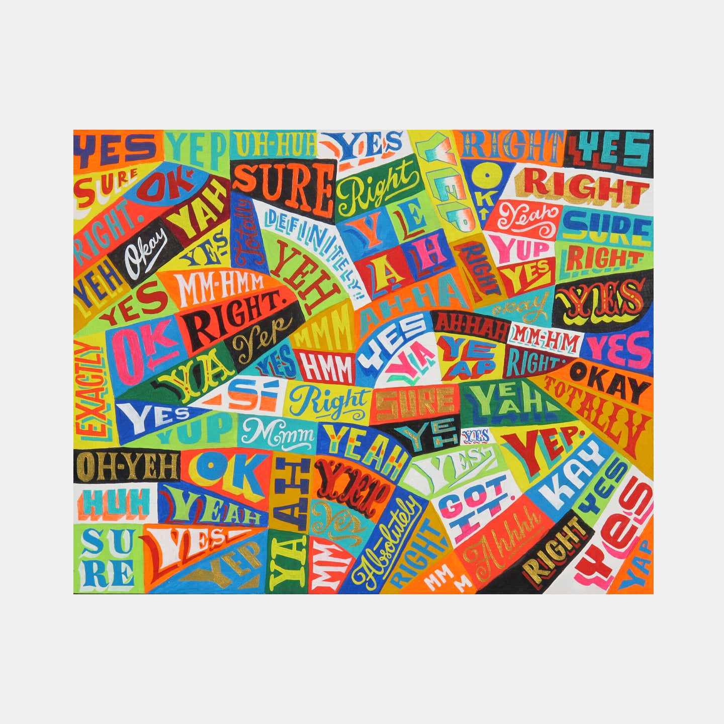
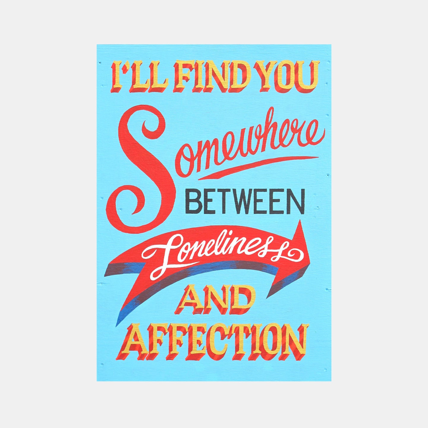
In San Francisco, I was invited to do a residency with the California College of the Arts. So that's where all of these paintings began - I lived in The Mission District, a mostly Mexican and Central American neighborhood, where there are tons of hand-painted signs. I would photograph every single hand-painted sign that I saw and initially, I would recreate them almost verbatim, but I would change the message. The messaging comes from my journals.

When you take inspiration from hand-painted signs, is that more as a general impression or as a more systematic study on them as objects?
Back in SF, they started as studies, and now I'm deconstructing them. I am moving away from a verbatim interpretation, and more towards unconscious interpretations, and letting things be more personal and more original.
WORKS BY THE ARTIST
I read on your website that you use repurposed wood as surfaces.
When I got back to New York (from California), I realized very quickly that I wanted to move into a surface medium that was more authentic and closer to what actual sign painters work on, which is usually wood, metal, or concrete.
So wood turned out to be a perfect evolution from paper. And I started actually learning some sign painting techniques too. It's harder to recreate these techniques on paper. It's much easier on wood.
You can start to see how my work evolved and went from a smaller scale to a little bit bigger as I started working on wood.
I see a bit more illusionism here, in Verdad.
Oh, totally, totally. It has a little bit of a Coney Island-like, circus kind of illusionist feeling to it. I had just taken a trip to Buenos Aires, Argentina. And they have an incredible hand-painted style of letterform called Fileteado, so this painting was very inspired by that trip.


So that’s an important thing to mention, that I often pull from resources in a lot of my travels to other countries, including Africa, Western Europe, a lot of Latin America, Argentina, Chile, and Colombia. No matter where in the world I travel, I seem to find hand-painted signs . It’s kind of amazing. And it’s usually in the outskirts, it's never downtown, it's usually as you're going into immigrant neighborhoods or outlying urban neighborhoods.
In 2013, I went back to the Mission and I painted a mural there in one of the mural alleys. And the interaction with the people was phenomenal because, if you've ever been in an outdoor art kind of experience, where people are curious and want to know, and ask questions like “Hey, what are you doing? What is this gonna be?” They just want to know what you're gonna make. That’s a really special memory of really connecting with the community.

As you briefly mentioned, you find the phrases for your paintings from your meditative diaries.
I meditate daily. I've been practicing the type of meditation called Vipassana meditation for about 10 years, which is very much about repetition. And it's about starting small and simple and building off of that. It’s similar to how, with the small, earlier paintings I made in San Francisco, I knew that there was nothing groundbreaking about them, that I wasn't reinventing any wheel. And I didn't worry, I just knew that this was a place to start. It’s a kind of wax-on-wax-off business - okay, now I’m just creating a base, then when it’s developing and feels like I'm building a little bit of confidence, I’ll go bigger.
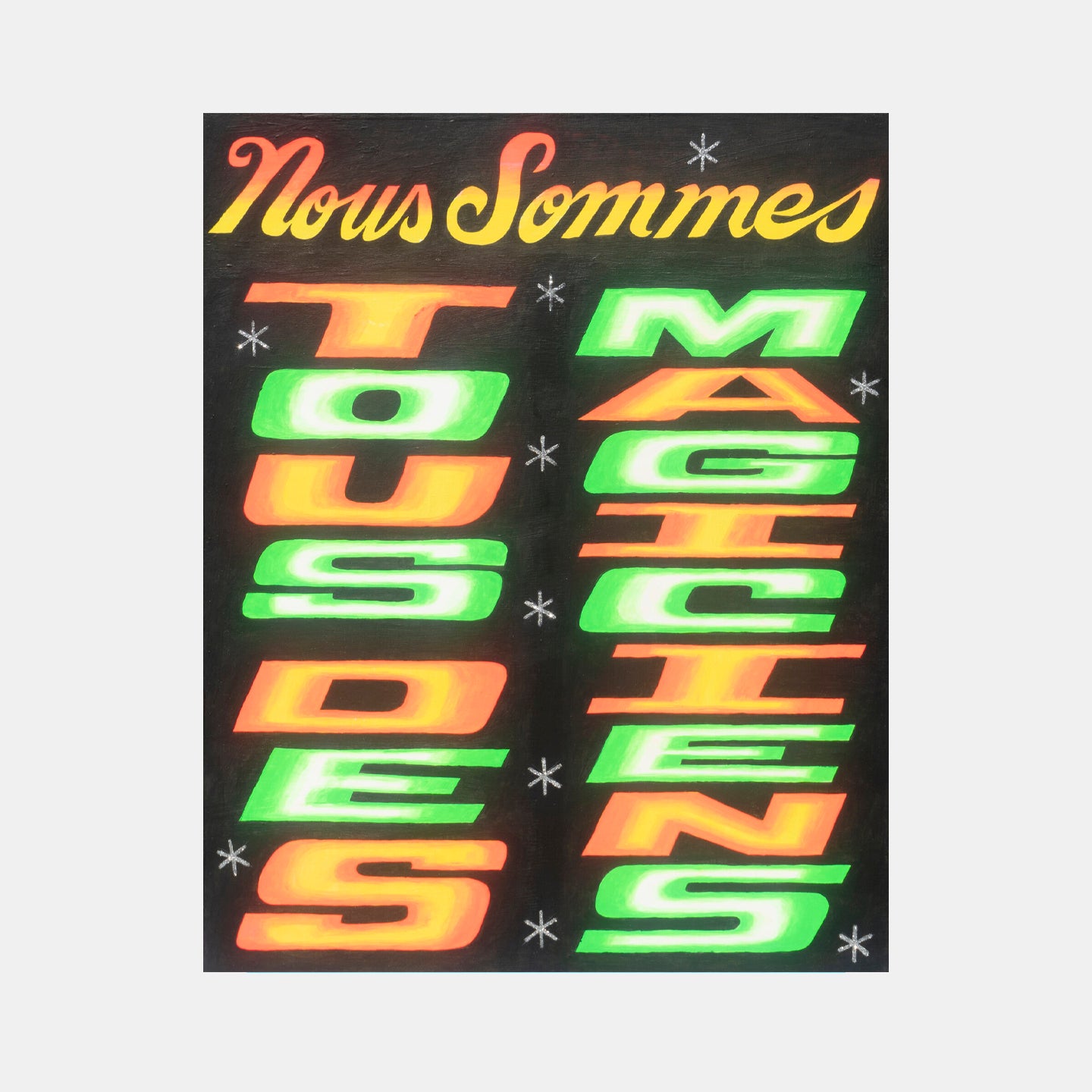
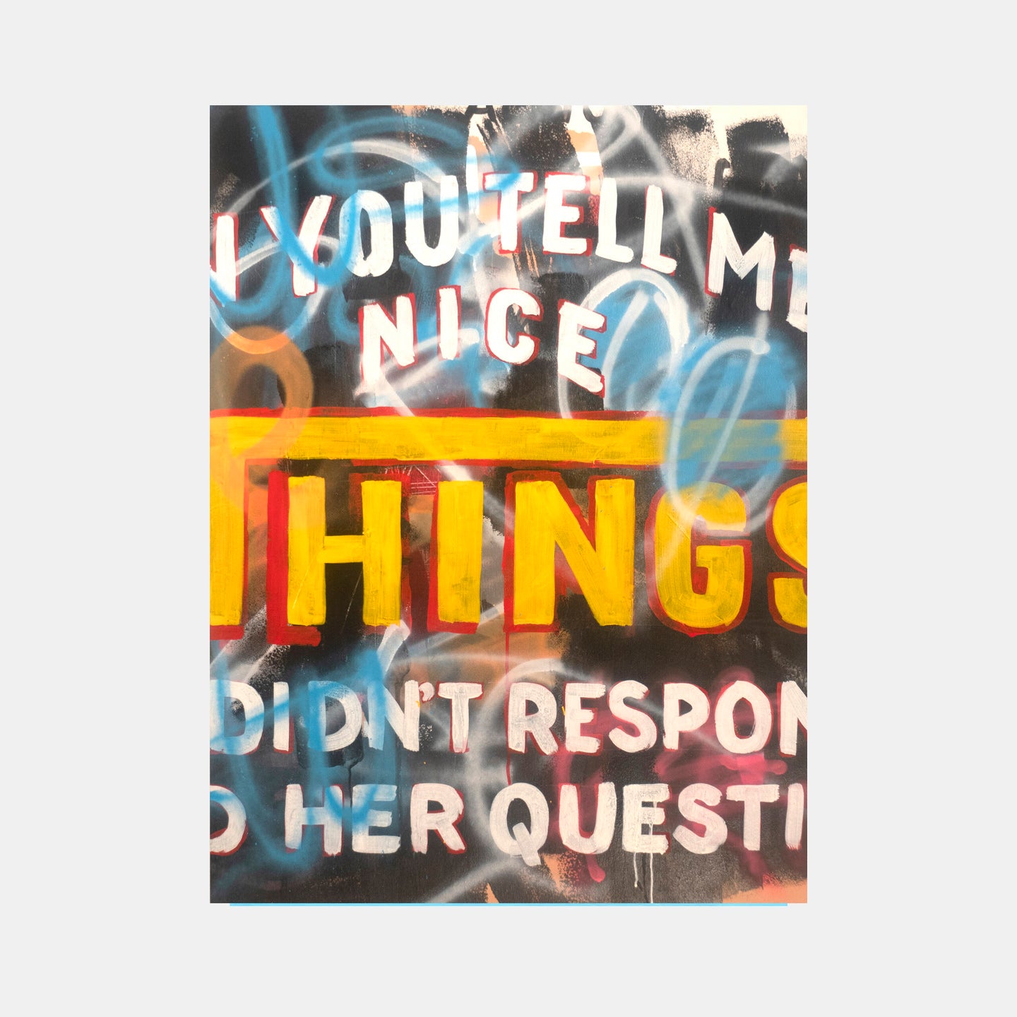
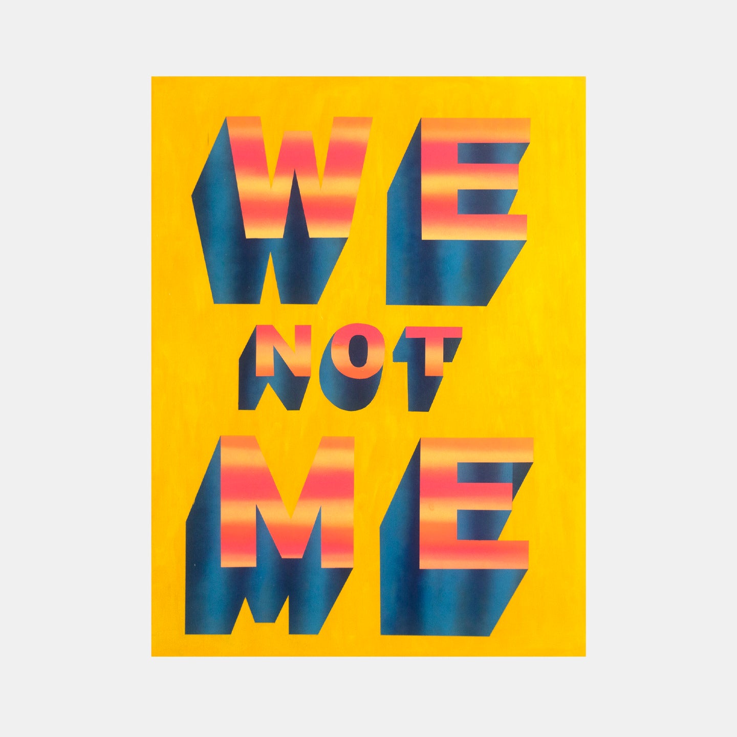
Pablo Medina, Things (2019)Pablo Medina, We (2019)
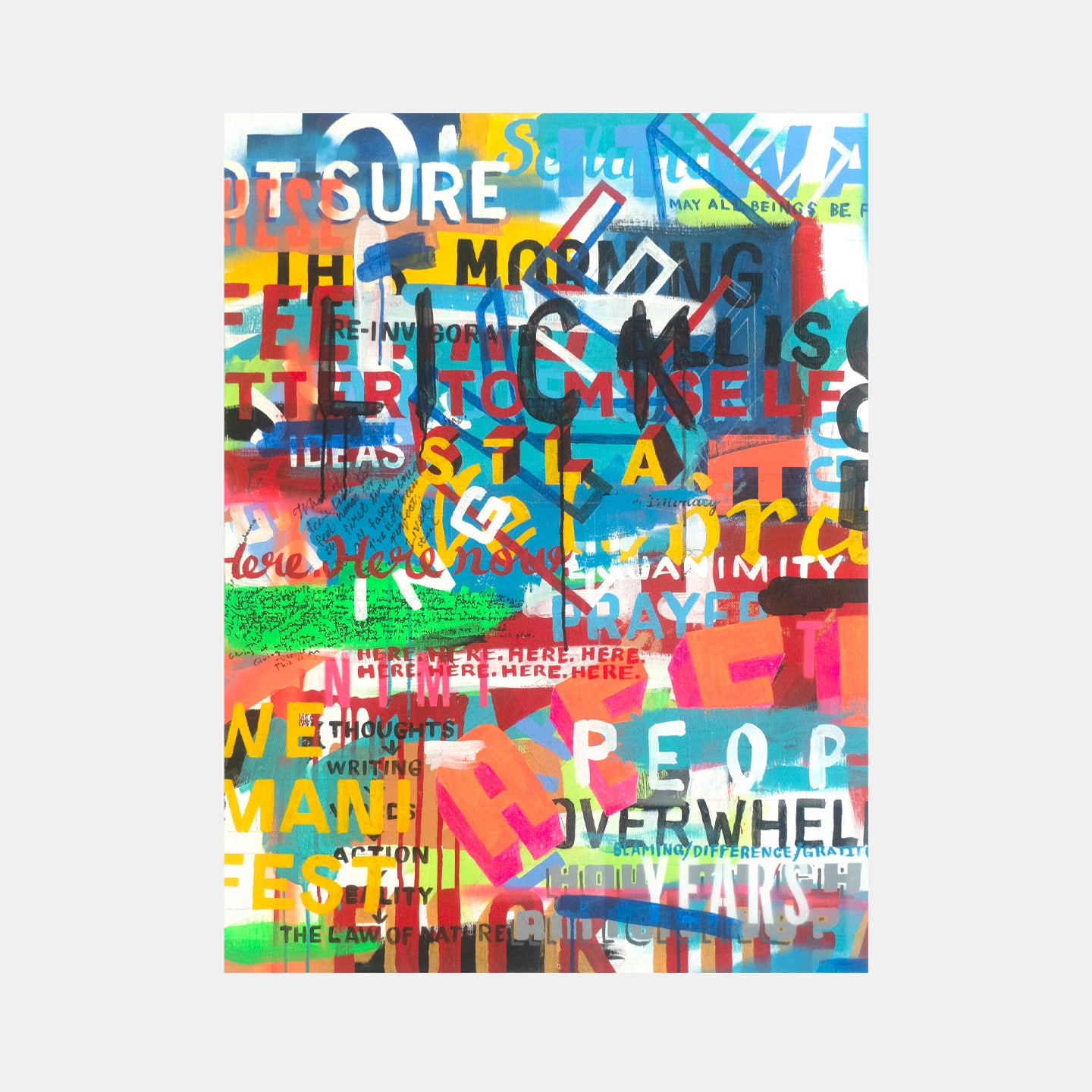
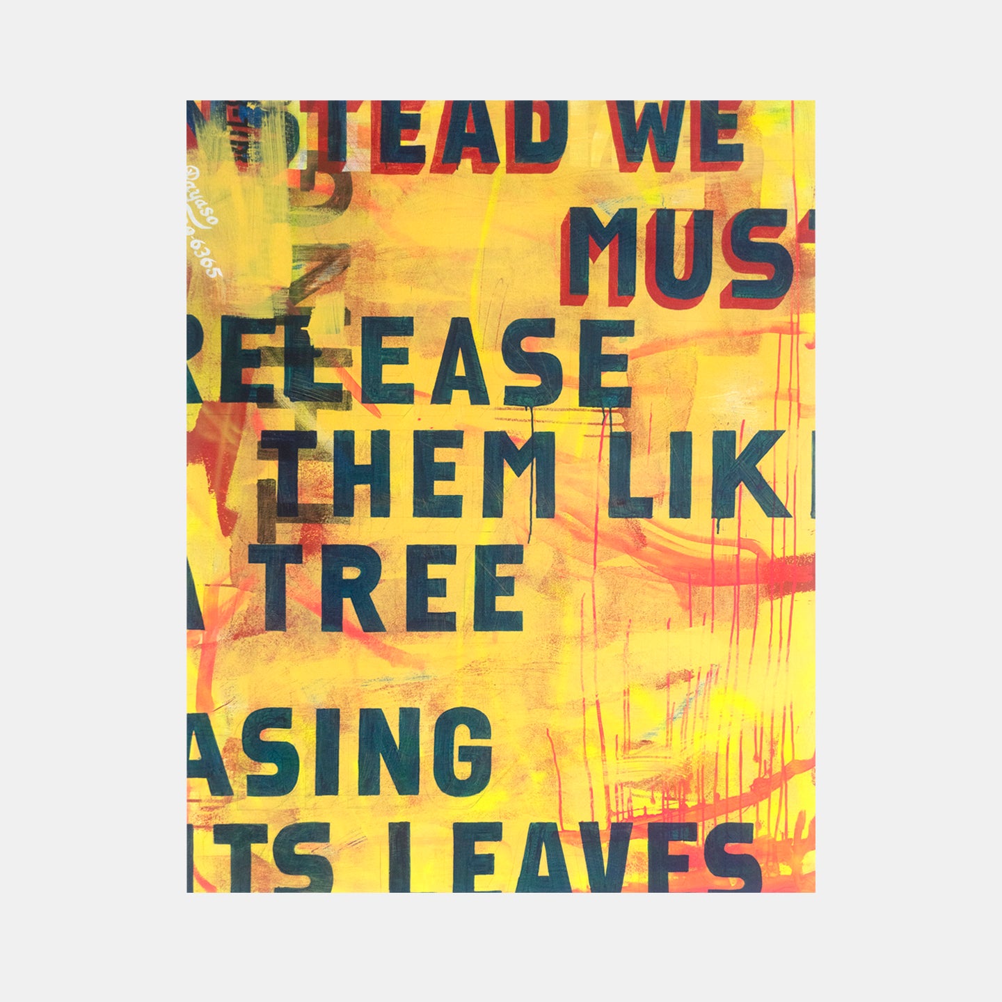
These bigger paintings came about after I was invited to exhibit my work at the Spectrum Art Fair in Art Basel. That was such a beautiful experience because you just see so much art. The experience inspired me a great deal. I came home filled with ideas and confidence to put time and energy to build a new, larger series of paintings. This also gave me the license to understand the impulse to deconstruct that I mentioned earlier. So these paintings are not necessarily as verbatim, but an amalgamation of so many different types of letterforms. I also started to develop a narrative of an alter-ego sign painter. I came up with this individual called Payaso, who is my alter ego. Sign painters usually sign their work and put their phone numbers on their work, so that's my phone number under the name.

Detail of Pablo Medina, Construct (2019)
I also incorporated the element of the work wrapping around the painting – it plays with the idea of pulling the street onto the canvas.
And you said in addition to meditating, you studied different world religions pretty seriously.
There's an undercurrent of spirituality, there's an undercurrent of religion. There's an undercurrent of different types of religions, including Buddhism, and then Yoruba religion. My dad's Cuban and my mom's Colombian, and in both countries, you see Yoruban religion, also called Santeria, which is a fascinating polytheistic religion with a world of mythology and aesthetics.

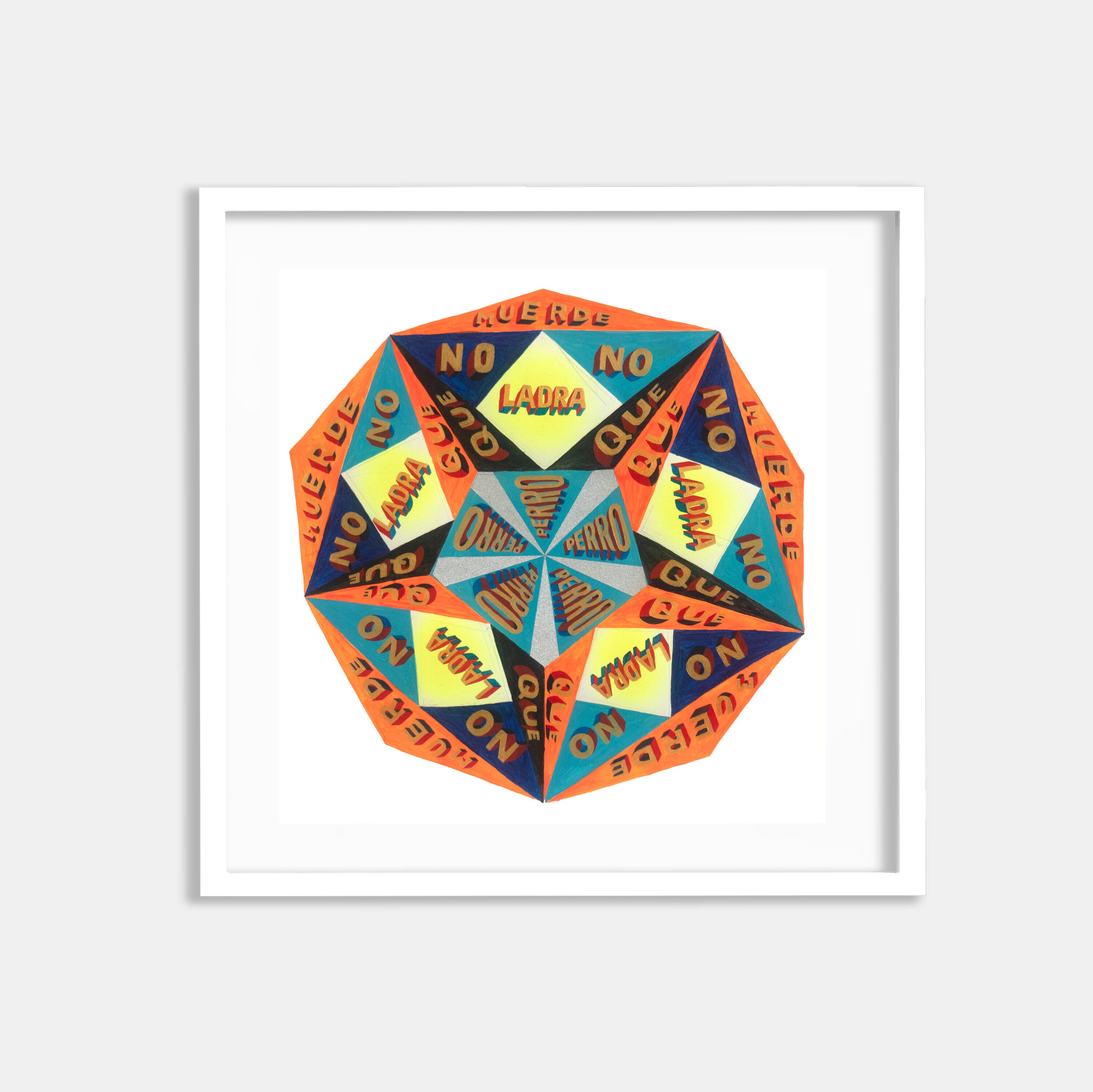
These works on paper lead me to a new current which is using resources from Africa and from the Amazon, places that I've always had a fascination with. Three years ago, I did ayahuasca and that was, from a creative point of view, the most influential internal experience I've ever had. I did it with a religion called Santo Daime which is a hybrid religion of Shamanism, Yoruban religion, and Catholicism. These works started as a kaleidoscopic form which is what I saw as part of the hallucinogenic experience, and they also have a mandala element. The text is all in Spanish, but they're taken from phrases from the Yoruban society in Cuba.
It seems like 2020 was a big leap for you in terms of activism.
2020 changed everything for me. Up until then, I always had this feeling like I was holding back because of the dominant patriarchal white culture, which was so deeply rooted in me. I gained a great deal of confidence in my work from all the collective anger and resistance that arose out of the racial uprisings. It gave me license to enact the kind of decolonizing theory that I had been thinking about for so long. I realized that so much of European modernism that was so rigorously taught in both art and design school was not the full story.

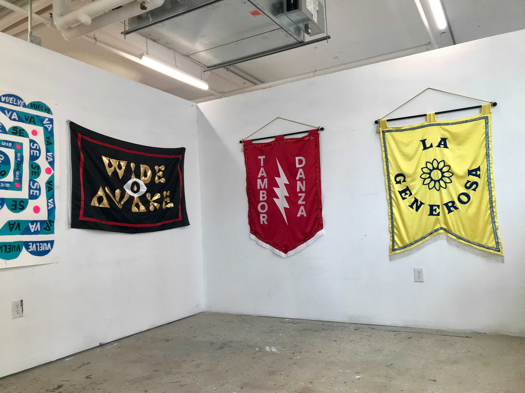
Pablo Medina, Wide Awake (2020) | Image courtesy of artist

One specific cause I took part in was an artist community called Wide Awakes, which I made this flag for. They organized a march on October 3rd where they recreated the march that originally had happened in 1865, led by abolitionists promoting Abraham Lincoln's presidential campaign. Hank Willis Thomas, and a number of other great New York artists decided to get together and recreate the Wide Awakes. Hundreds of artists made art specifically for the march - there were marching bands, stilt walkers, acapella singers, live music in the front of the courthouse building. One of the underlying themes of Wide Awakes is that anyone who wants to be a Wide Awake can be. They really encourage joy, especially during times of political turmoil. They encourage you to not get sucked into the darkness of it, but to move towards the joy of who you are.
Was the Wide Awake flag the starting point for your other flags here? Do you see yourself pushing the medium further?
Yes. I’ve been making a lot more flags recently. These banners I've enlisted help for - I have a friend who is an excellent seamstress. Each flag is dedicated to a different Yoruban deity. The blue one is for Yemayá, the Orisha of the ocean, thus the aqua and blue color. She is considered the mother of all things. One of her symbols is the moon because of the interrelationship between the moon, the ocean and the divine feminine spirit.

The red banner is for Changó, the Orisha of drum and dance. When I exhibit it, I will hire a dancer to do the Changó ceremonial dance.
“Tres en Uno” or “Three in One” is based on my own experience of being three cultures in one: I'm Cuban, Colombian, and American. So I have this theme of “three” throughout my work.

Pablo Medina, Sadhu (2020)
The other thing that I'm working on currently are larger works on paper. One struggle in my work is that my works leans towards precision. Subconsciously, I find myself refining my work too much, and that's fine sometimes, right? But I really have to force myself to loosen up. So these new works on paper are me trying to loosen up.
I’m wondering do you still play music or engage with the scene in some way?

Yes, yes, once a Punk, always a Punk. I don’t play in a band anymore but I am very interested in performance. I’m a dancer, and I’ve been following more performance artists. I made this headpiece and I’m planning on doing a performance with it.
What exciting things do you have in store this year?
Now that we’ve opened up from COVID lockdown, I’m just excited to reconnect with people again! I am applying to a residency at the Neon Museum in Las Vegas, which would be so perfect. I’ll be doing a screen print fundraiser for Wide Awakes in the fall. And I will do more large scale paintings, like very big paintings. And more murals. I've done three murals but I’m always looking to do more large-scale stuff.


